Whew, I thought I was going to get another binding into the museum today and do a blog post about that, but busy busy. Instead, got a bunch of small details taken care of in website design. I’ll do the binding this afternoon and post when it’s ready. It’s one of the original Dynafit models from way back.
As many of you know but is good to occasionally point out, WildSnow consists of a blog with thousands of posts, but also a full-on conventional website that organizes more than 200 pages of our extensive articles, binding reviews, historical writings and more. I’ve been working on-and-off to get the website a bit more pleasant looking as well as centered on the screen like the blog, so switching back and forth isn’t quite as harsh. Finished up much of that this morning — but a website this big never ceases to require edits, updates, etc.
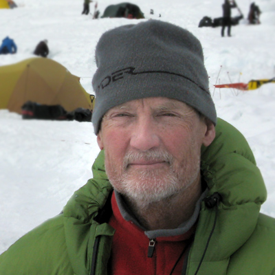
15 comments
Hey Lou!
IMHO….gimmicky…looks like an ad!
Steve
Randomeo, I’m thinking the same thing… someone else suggested I make the links look less basic and perhaps it would fit in better. Or I could just do five static links that kept changing as I updated… Anyone else?
Lou,
I like the new look, as for the news scroller, I think it is fine. I visit here enough, as do others, and realize this is site that doesn’t trick me into viewing advertisements.
The only improvement I would like to see is a spot-on accurate snowfall forecast by mountain chain for the upcoming winter so I can plan my trips better:)
Scott
I like the news portion just fine except slow down the scroll
Sorry to say I am not a fan of the scroller. At least slow it down but I would vote for just a changing list. About the blog categories, is there a list of ski reviews? It seems there are tons of boot and binding reviews but none for the sticks. I have to say though I have wild snow as one if my home pages. As I have recently moved from CO to Portland, OR it is nice to feel connected to mountains I so dearly miss. Thanks.
I think the scroll is OK but it’s too fast. Also the blank space at the end of the scroll is a waste, a line dviding the start from the end would be better. And if the scroll background was grey rather than white I don’t think it would look so much like an ad.
I like it actually, but agree, slow it down…
Scroller is good, but too slow. Just kidding; it is a bit fast.
Thanks for the feedback folks. I’m looking at other scroller solutions, hope to change this week. Lot’s of stuff out there but it’s mostly junk.
It gets better and better. What, no seperate blog category for ski reviews?
I don’t like the scroller – the movement to the side distracts my eye from the content that I’m trying to read. How about a drop-down menu, or a very conspicuous link to a page devoted to news items?
Lou,
Could you please point me in the right direction? I am just starting up a website devoted to our RV backcountry and resort skiing trip this winter across western north america and would like to create a blog with advertisements in a similar format to yours – I like the way they are neatly organized down the sides and easy to see, yet don’t interfere with your website clarity. How did you set that up?
Thanks for any help you can provide!
Anna Boone
Hi Anna, I put a lot of thought and effort (and work) into the design, and have noticed others following along, sometimes pretty much copying it. Flattering. I’ll email you and see if I can help you out.
noticed these weren’t in your binding museum, but I’m not willing to pony up the $400 CAD for them! http://www.kijiji.ca/v-ski/edmonton/touring-skis-with-bindings-and-climbing-skins-188cm/1114867249?enableSearchNavigationFlag=true
Hi PK, luckily we do actually have a pair of those, just not online yet… Wow, $400 for antique skis, I wonder how much my attic is worth!? Lou
Comments are closed.