It’ll be official in a few hours but I got the go to talk it up. Black Diamond has been working their tails off on what they intend to be a state-of-the-art website that combines high-end edited content, shopping cart, and more. The site was loading a bit slow for me when I last looked, but once it’s chugging along I’m sure it’ll be snappy and no doubt something to behold. Check it out and leave a comment here with your opinion! I’ll keep my trap zipped and see what you guys have to say.
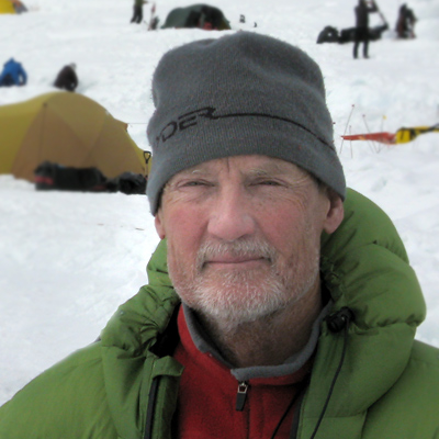
WildSnow.com publisher emeritus and founder Lou (Louis Dawson) has a 50+ years career in climbing, backcountry skiing and ski mountaineering. He was the first person in history to ski down all 54 Colorado 14,000-foot peaks, has authored numerous books about about backcountry skiing, and has skied from the summit of Denali in Alaska, North America’s highest mountain.
23 comments
Definitely flashier, but not really more useful. I like the sub-sorting of categories with the selection boxes, but the lack of any sort of info (other than marketing copy) on the selection page makes comparing different products a needless pain.
Looks pretty flashy, but I agree the content isn’t much better than before. I only noticed a few more details about the gear. The tech specs could be much more informative. Interesting that there doesn’t appear to be any ability to comment on the gear. I can appreciate that this might be scary for a manufacturer, but it’s a very useful thing for consumers.
To check their site, I went to the ski pole section. I’ve been frustrated with their lack of interchangeability between pole sections. For example, there is no way to tell (just based on published info) if the new expedition has same diameter as old expedition. New models look nice, but still no three section whippet.
From what I understand, they’re planning on packing the thing with well written and edited content — they even hired an editor. Perhaps they’ll send him my way for a few hours a week (grin)?
Cool. Noticed they have the new Mohair skins for sale in North America now. The skins are all up on the site.
Site looks good. But more product info would be nice.
I was pretty excited to see the redesign initially because their old site was getting pretty long in the tooth, but I immediately got lost trying to find my way around. It’s pretty over the top and gets in the way of itself. I think the marketing group tried too hard to pack every flashy feature they could think of into it instead of thinking through what’s best for the user.
It’s great that they’re going to be adding lots of new content but I wonder if people are going to be able to find it.
First impression was irritation with the background movie and music. And then it was slow, slow, slow navigating trying to find things. Looks nice once you get past the intial page, but not very user friendly.
I think it’s interesting to really try and mix a corporate/sales website with a content website. BD obviously wants their site to stand apart with a very flashy design, but then, flashy designs can make it hard to present content in a truly useful way. That is unless the site design changes depending on where you are within the site. But then you get into useability issues. Interesting to see them work at this. Kudos to them for getting after it.
Also interesting the way they’ve pretty much gone beyond anyone with a 56k dialup connection, in terms of load time. That’s of course where you need to go if you’re doing much with a website these days, as it allows you a lot of freedom with design using movies and large images, but it does cut out some users.
WildSnow takes a few minutes to load at 56k, but I know people who use it that way nearly every day. In fact, I work my tail off to reduce my site latency, but displaying all my advertisers keeps it slowed down. Of course, without the ad banners (thanks BD and all) I couldn’t afford the time to work on the site latency. Catch 22 (grin)?
In the end, I’m certain what we’re seeing of the new BD site is a design iteration and they’ll soon improve the load time, get the glitter under control, and add more content. They might have gone public with it a little early. On the other hand, feedback like that from you guys is key.
Fairly easy navigation is what I saw. Can you tell what product sells best for BD? That’s right: ‘biners.
Too flashy. I’m a fan of straightforward simplicity in most things, and website design is no difference. I want product info (and lots of it), not a full page movie of biner production.
it didnt work right for me ,if you click on skis and check out the megawatts there is part of a search function blocking the ski dimensions
yuck. the days of wowing people with flashy sites are over. make is quick and simple to show us what your selling. give us the option to see detailed photos of what your selling. patagonia has always done this well. hopefully the bd folks aren’t done with this yet, because on my turbo charged high speed connection the ski category wouldn’t load.
I can only watch that front page video a few times before it gets old and I find it to be a bit distracting when reading text. Too flashy for me.
I generally like simplicity and access to a good story, which is partly why I like wildsnow.com, but it’s interesting that as I cruised the site (albeit slowly) my 5–old son was intrigued by the carabiner videos, etc. He’ll probably being trying to replicate something out of their factory with Legos this afternoon.
Way too much branding, flash, noise, movies and clutter. It actually makes me want to visit this site less rather than more. With all of the obvious time, effort and money that must have gone into this, I suspect the print catalog will soon be thing of the past.
Retrogrouch here to say, “Slow and annoying.” And I have highspeed…
A manufacturere’s website should have oodles of gear info, weights, sizes etc, [kinda like wildsnow] and should be easy to figure out. It took me literally 15 seconds just to figure out that I had to click on the words to the left side of the screen to get anywhere. Didn’t help having the distraction of a video in the background – that is once it loaded…
so they took their website that was a 1990’s era relic and updated it to a flash site from 2004. too bad they couldn’t get it updated all the way to 2009 with AJAX and things that actually make a website more useful instead of just eye candy. also, don’t they know that forced video and audio are a big no-no in the usability world? once again the outdoor industry proves it has no idea what the mainstream is doing.
I agree with bj. The site is too hard to use and having video and sound as the first thing I see it too much. I don’t care! I am there to find out something about a PRODUCT or amazing I might want to buy a product or contact BD. The new design does nothing to help with the above. The articles are nice, for me they are not the main attraction. BD would get more cred with the articles if they didn’t try to sell BD products in ALL of them. The new sites navigation is horrible and a real turn off to me…. too hard to find products.
BD, hire a firm or person with UI expertise and listen to them!
The sites opening carrabiner factory movie will get old fast. The new Havocs ARE SOFTER-darn. They were known for their snappy tail and good feedback from the snow- ohhh no!!! Good site overall.
First thing you never do, force sound on the user!
The carabiner movie is pretty inline with a lot of current design, but I say stick with the hi-quality, full screen still image instead of the pixelated, incredibly short looping video. get’s old, and the images are not pretty.
Take the above ideas, refine the text on the home page nav a bit and the site has a lot of potential.
What really killed me though was that after clicking the “skiing” link and getting the little nav box, which then smoothly dropped off the screen after making another click, i went to a page that was just a standard, boring template. Then going back to the home page reloads the video and sound. no no no. May as well just skip the home page and go straight to the insides.
Regarding BJ’s comment about the outdoor industry, i think that’s pretty off. A lot of outdoor companies stay on the cutting edge (especially on design) b/c they know they won’t lose customers on “scary” design. It’s the product that counts, so they don’t seem to be as conservative.
This is how BD’s site could have been (not continued use of large photos)… http://www.yeticycles.com
another nice site: http://www.orage.com
Anyway, i think BD should keep pushing their ideas and morph the site from where it is to something truely great.
cheers.
Robin B, perhaps BD is depending on us bloggers to get the details out? I kinda hope so (grin).
Dave, thanks for the comment from a pro. That Yeti site really is something. I noticed one thing I thought bogus, the nav links don’t have a mouseover effect (at least they don’t on my rig). With big links like that the mouse cursor gets lost unless your vision is 20/20, so having a mouseover effect really aids in usability. Of course, what’s usefulness compared to cool design (grin)?
Lou, there must be something wrong with your setup. On the main nav, the black links turn blue when you mouseover.
Mike, what browser? I just looked at it with IE and saw mouseover action… When I was browsing with Firefox, I didn’t get any on the nav menus with the really big text… Or perhaps they fixed it over the last few hours. No time here to got back and look at the moment… From what it looks like in IE, the designers do indeed see the necessity of mouseover/rollover, so good, if it doesn’t work in Firefox I’m sure they can easily fix it.
Comments are closed.